
Please wait a moment. Thank you.
Please wait a moment. Thank you.
GT America builds a bridge between the American Gothic and European Grotesque typeface genres. It combines design features from both traditions and unites them in a contemporary family. The versatile system consists of eighty-four styles across six widths and seven weights. Exclusively available at Grilli Type.

The Compressed subfamily contains the most condensed and tightly spaced styles.

A more condensed, space-saving adaption of the Standard subfamily.
Optimized for text size usage, this subfamily looks relatively narrow but is spaced widely.

All characters are the same width as the tabular figures in the Standard subfamily.
The Extended subfamily is the Standard’s more Grotesque-looking cousin.
Expanded is optimized for large display uses and is very expressive in its design.
Stroke ending angles adjust to function optimally in each style.
Tapered stems help to avoid dark spots in tight corners.
Thinned stems and angled spurs achieve the same effect in lowercase letters b and p.
All styles contain an alternate g for a more Swiss Style look.
Move your mouse around Tap anywhere to test the different widths and weights of GT America.
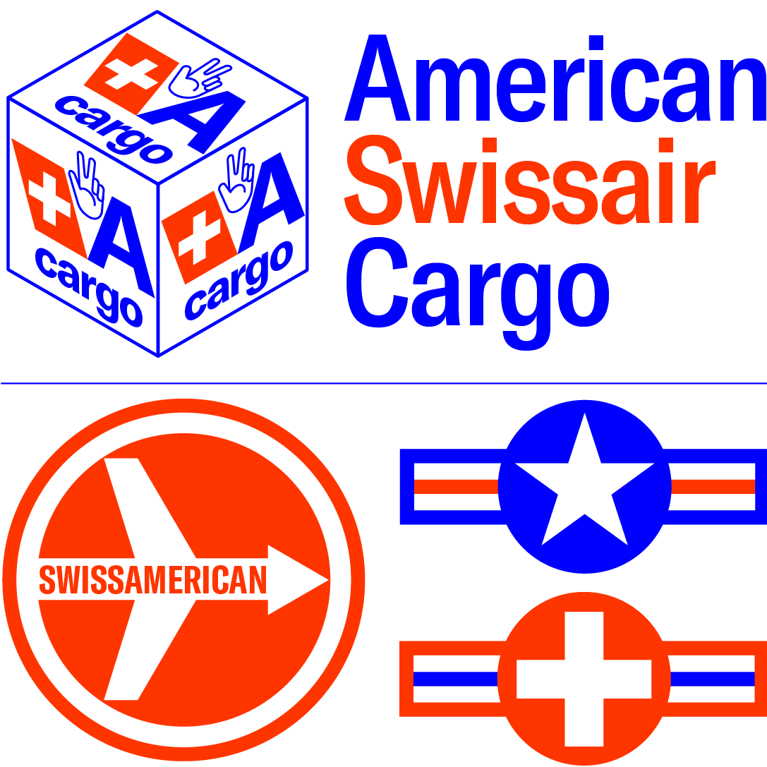
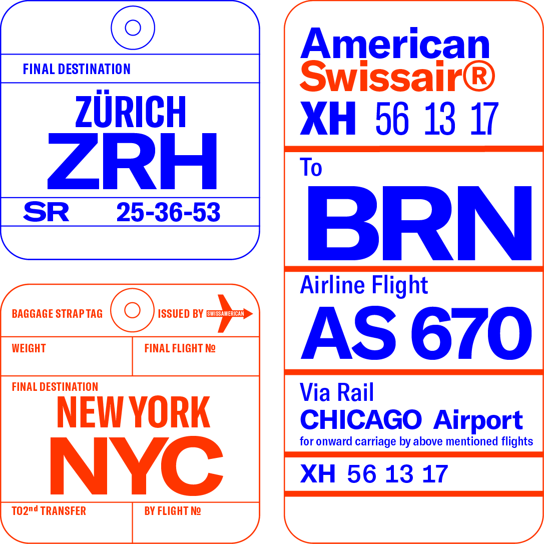


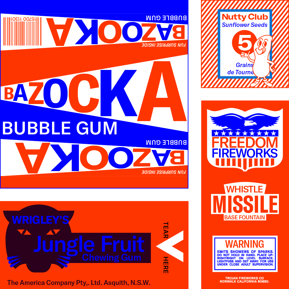
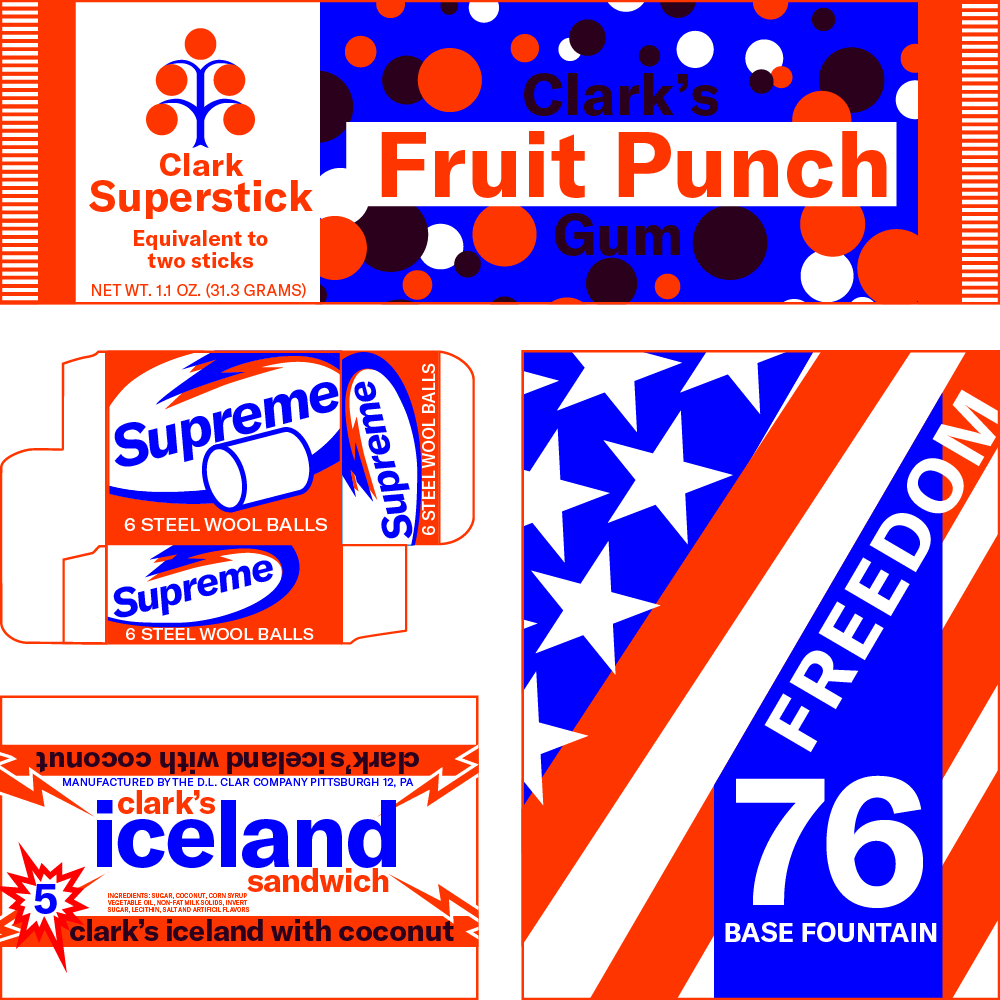
Repeat after me: I pledge allegiance to the flags of GT America, and to the foundry for which they stand, many glyphs in one font, indivisible, with spacing and kerning for all.
GT America was designed by Noël Leu, with Seb McLauchlan. Animations by Josh Schaub. Website and illustrations by Grilli Type.